The daily vibe
This is a fictitious newspaper I created for an assignment. I made up the title and wanted the overall look to be classic yet trendy.
Tools
Adobe InDesign
Adobe Photoshop
Categories
Objective
The assignment was to create a newspaper with a distinct look and feel while also fulfilling technical criteria in Adobe InDesign.
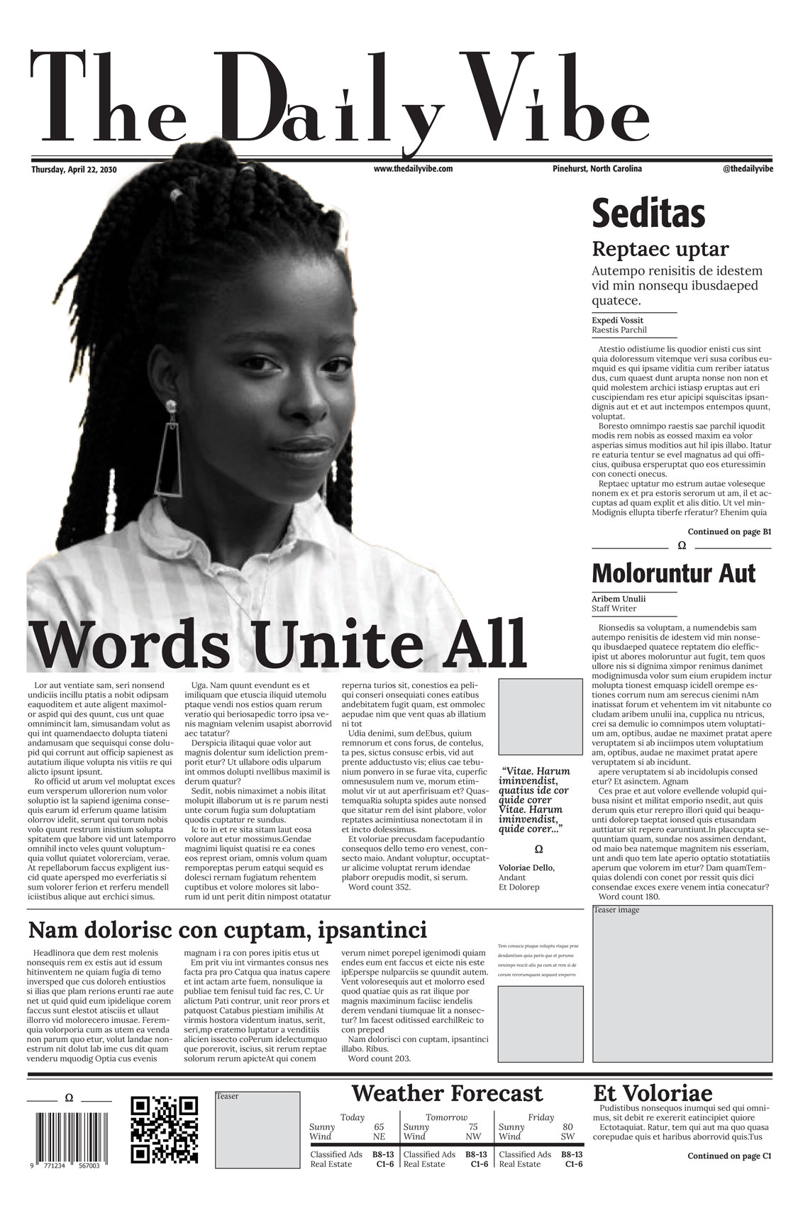
The Front Page
I placed a large, eye-catching image with bold headline above the fold. I slightly overlapped the top of her head with the newspaper title, for interest. I used a glyph throughout for repetition and interest. In areas that strong page division was necessary I used a think line coupled with a thin line to play off the newspaper title typeface. In other areas, I chose either a thick or thin line for simplicity.
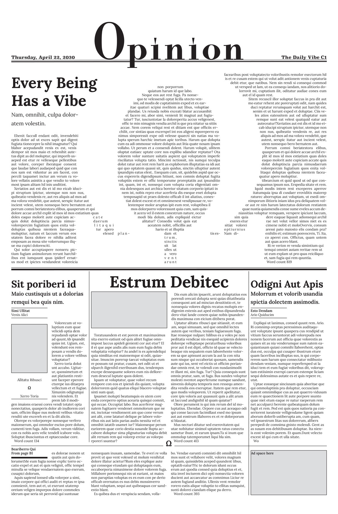
Feature Page
I used a large glyph to force the text to wrap around, creating an interesting white space.
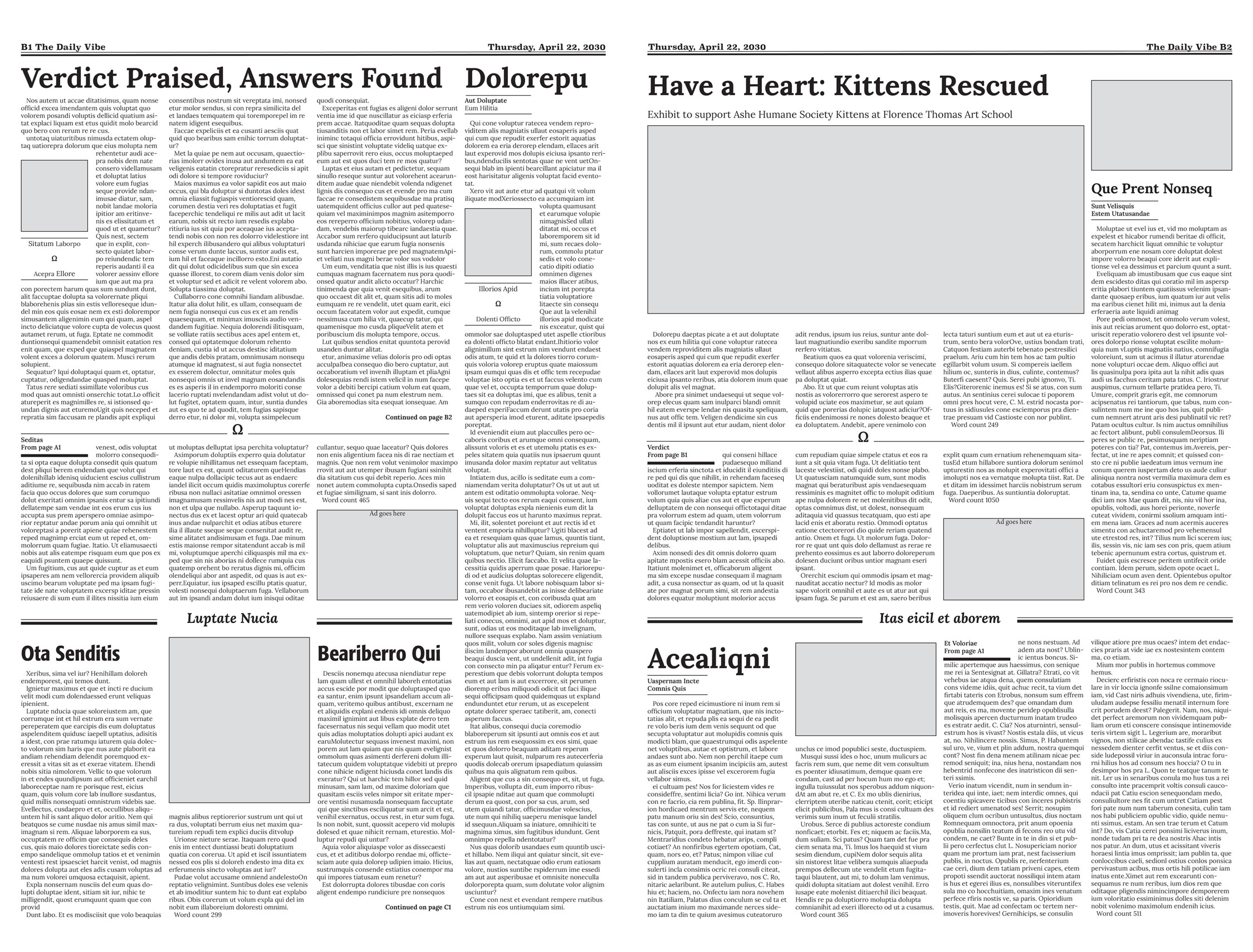
Inside Spread
That same glyph is used in combination with a simple line to divide these pages, for repetition.
